Group Questionnaire

Below is the questionnaire that our group have compiled to gain research for our film project. All questions are relevant in helping us find out who our target market will be and what genre of film they will be interested in. Although we have previously chosen to create a romantic comedy, the results of this questionnaire will help us build around our genre.

1.  Gender: Male ___
                     Female ___

2.  Age:     11-15 __
                    16-19  __
                    19-25  __
                    26 +     __

3. How often do you go to the cinema?
             Never
             Rarely
             Often
             Regularly (how many times a month) ___

4. What is your favourite genre?
            Comedy
            Action
            Horror
            Rom-Com
            Sci-fi
            Thriller
            Other

5. What genre was the last film you watched at the cinema? …………………

6. Do you ever rent DVD’s?
           Yes
            No
7.If yes, how often? ........................

8.  Do you buy DVD’S?
            Yes
            No
9. If yes, how often? ........................

10. What type of adverstising would make you want to see a film the most?
         Film Posters
         Film Trialer
         An article in a magazine
         A films website
         Watching tv specials on the film

11. Why does this type of advertising work the best for you?
 .................................................................................................................
..................................................................................................................
..................................................................................................................
..................................................................................................................
..................................................................................................................

Romantic Comedy Film Poster Analysis

THE BACK-UP PLAN FILM POSTER ANALYSIS


The Back-Up Plan, starring Jennifer Lopez is a typical romantic comedy and the film poster follows certain conventions that help it achieve its aim in appealing to its target market of females. To begin, romantic comedy film posters tend to contain the same things, so that audiences can tell what genre a certain film belonged to by looking at the poster alone. This poster  has a female and a male lead which is very common in rom-coms, this is indicated by the pose they are standing in on the front cover, they are at the same level and are not standing behind each other or in front of each other and this suggests they both hold equal importance within the film. The female character, is wearing a tight dress and the male character is dressed more casually in jeans and a t-shirt, this represents the difference of life-styles within the film but it also suggests that the characters follow gender stereotypes e.g women being viewed as sex symbols. Both characters featured on the poster are smiling, this shows that the film is a happy and funny, this is indicated through their facial expressions. The prop used, the baby shoes that Jennifer Lopez is holding, links to the film as it is clear it will contain children. She is hiding them behind her and not putting them on show so this suggests she is keeping secrets. On the film poster i could use props in the same way to let the audience know a little bit more about the films content. The title of the film is unusually placed down the middle of the poster between the two characters, this could foreshadow the film and suggest that their is a divide between the characters. The colour pink is used a few time on the movie poster which is automatically attracting its intended audience as it is a feminine colour. 

WHAT HAPPENS IN VEGAS FILM POSTER ANALYSIS
The second film poster that i will be analysing is What Happens in Vegas. This film, starring Ashton Kutcher and Cameron Diaz follows the lives of two strangers that accidently get married during a trip to Las Vegas. Firstly, although the characters are on the same level as each and are therefore equally important characters, Cameron Diaz is standing taller than Ashton Kutcher, who appears to be bending down. This tells the audience a lot about the relationship dynamics within the film, that Cameron appears to be superior and above the male character. The clothes that they are wearing also indicate this as similar to The Back-up Plan trailer, the female is wearing a short dress whereas the male character is dressed in a t-shirt and jeans, this shows a lot about their lifestyles within the film.  Both characters featured on the poster are smiling, this shows that the film is a happy and funny, this is indicated through their facial expressions. The font of the title of the film is reasonably simple and is red in black in colour. Although this is a rom-com and this genre is usually targeted at women, the title colours and font suggest that this film is also aimed at men too, as these colours attract both sexes.

Film Trailer Analysis

NEW MOON FILM TRAILER ANALYSIS


This is a film trailer for the teenage fantasy film, New Moon. New Moon is part of the Twilight Saga which seems relationships and enemies formed between humans, vampires and wolves. The trailer begins with a crane shot of the landscape so we are able to see where the film is set and above this a score is played to introduce the trailer, the score is mysterious in sound and dramatic, this helps the audience understand that the nature of the film is mysterious and dark. Throughout the trailer is a variety of medium close-ups and two shots, usually of two different characters involved in a dialogue, this is done so that the audience can see the intensity and emotion between the characters. The trailer contains a violent scene at the beginning between two male characters and is shown through use of slow-motion effects. This slow-motion is used to add suspense and to intensify the violence shown within the trailer. This slow-motion is used once again to intensify violence when a male characters turns into a wolf during the end scene of the trailer. During the violent and fast action scenes, the music changes dramatically; it becomes increasingly faster and this is done to mirror the fast-paced action. The running emotion throughout the trailer is a scared and worried emotion and this is indicated through the characters facial expressions. At the end of the trailer when the female character is threatened by a male enemy, the scenes are brought together through a faded transition between shots, this is done to add suspense to the trailer and the scenes itself and ends the trailer dramatically enough to leave he audience desiring how the scene will finish.


THE HANGOVER FILM TRAILER ANALYSIS


The Hangover, released in 2009, is a comedy about 4 men and their adventure in Las Vegas, USA. The trailer opens to an establishing shot of a house and a medium close-up of two men, this close-up is used so that the focus of the scene is on there facial expressions and the dialogue. Following on from this the trailer has a fast-paced score over the top that could be described as a 'party song'. This score is used so the audience understand that the film involves a night out partying. The majority of the trailer is short scenes set into a collage style of play and these scenes are very fast moving, this foreshadows the film as it appears to be crazy and shows the fast pace, disoriented experience the men have whilst they are in Las Vegas. Fast music is playing over the top once again to put emphasis on the wildness of the film. As the men wake-up from there night in Las Vegas, the music is much slower and the scenes do no move as fast, this shows that they have come down from their 'wild' night. Throughout the trailer, text appears in several shots. The text involved is a bright red colour and appears to be flashing/glowing, this represents the lights and signs of Las Vegas, to continue the theme of where the film is set.


THE LIZZIE MCGUIRE MOVIE FILM TRAILER ANALYSIS


The above trailer is for The Lizzie McGuire movie which is a Disney film and therefore aimed at young girls. The film trailer appeals to their audience by including fun special effects such as sparkles and sound-effects during scene transitions. These effects are used to engage younger viewers as they will be interested in seeing things like sparkles, especially young girls. Slow-motion is used repeatedly throughout The Lizzie Mcguire Movie to ensure that the focus is on Lizzie McGuire (Hilary Duff) herself, this is a convention used throughout the genres when creating film trailers, consequently i intend to use this convention myself in the film trailer i will be creating. Unlike the other film trailers i have reviewed, this one contains a voice over, this is done so that more content about the film is given whilst scenes are playing to let the audience know more about the film. The trailer has a fun, pop-style score playing over the top of it and this is done to appeal to its audience of young girls. Throughout the trailer there are a variety of different landscape shots, some in America and some in Italy, this is done so viewers are aware of what country the scene's are coming from to avoid any confusion. Similar to The Hangover trailer, there is also text running through the scenes, this time the text was girly colours e.g pink and purple and had an intricate font style, this was again done to appeal to its young girl target market.

Film Magazine Analysis

NEW MOON FILM MAGAZINE ANALYSIS


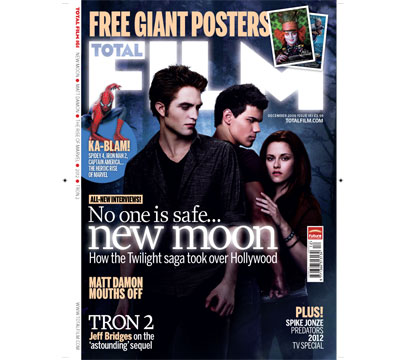
Total Film is a popular film magazine and this issues cover features the cast from the Twilight Saga New Moon. The image used, including the background is lifted straight from the movie poster published by the film and on the cover of Total Film magazine, however the colours  have been manipulated slightly. This time, the background is a dark navy colour, this deepens the sense of mystery and darkness that mirrors the content of the film. The masthead of the magazine and the main text that reads 'New Moon' appears to be illuminated, this could be seen as imagery, as if the masthead were the moon as it seems to glow against the background similarly to the film poster where the moon itself is glowing. The main text that advertises New Moon is in the centre and the largest text on the cover, this shows that it relates to the image and is the main focus of the magazine. I think this is a good film cover as it relates largely to the film and gives us a sense of the film content, it includes the main cast members of he feature and follows the structure of a typical magazine.


CHARLIE AND THE CHOCOLATE FACTORY FILM MAGAZINE ANALYSIS


This is another magazine cover from Total Film and features the actor Johnny Depp as his character Willy Wonka in the latest Charlie and The Chocolate Factory Film. He is dressed in full Willy Wonka costume and this shows readers what his character in the film is like appearance-wise, the pose and photo would not have been taken in a shoot set-up by Total Film, but it would have been taken from the films gallery and used for the front cover. It would not be possible for my group to do this (take others images) and we would have to create our own as this would breach copyright laws. The colours used on this front cover are very bright and colourful and this allows the reader to understand the nature of the film; it is a fun and cheerful feature, which is mainly aimed at children. The font is very simple and plainly coloured which suggests that the magazine itself is aiming their prints at male audiences as women are more attracted to brighter colours. Total Film follow the conventions of a regular magazine by including mastheads, side texts and puffs all of these help Total Film appeal to their audiences. Overall i believe this is a good cover for Charlie and The Chocolate Factory as it includes one of the star cast members but apart from the costume Johnny Depp is dressed in, it does not give too much of the films content away.


TRANSFORMERS 2 FILM MAGAZINE ANALYSIS


This is the May 2009 front cover of Empire magazine, which content specializes in films. The particularly film that is starring on the cover is Transformer's 2 where one of its cast members, Megan Fox, poses for Empire magazine. Before reading anything written on the page, it is clear that the magazine cover was intended to appeal to its male audience members as the provocative pose that Megan Fox is in fulfills stereotypes of women being sex symbols. The front cover also shows that the magazine is aimed at males as the colours and font styles used are very masculine. They are mainly blue, deep red, black and grey and the font is pain and not fussy which would appeal to a male audience rather than female. This magazine among with the other two above follows the usual style that a magazine would, its text is around the outside edges of the cover so that the main focus would be on the centre image.  Overall, this magazine cover fails to advertise Transformer's 2 well at all, the main image has very little to do with the film itself apart from the fact that she is a cast member and it shows no content or link to the film whatsoever. I would use this research when creating my film magazine poster by ensuring that i link to image to the content of the film i have produced so the audience will have an idea about the nature of my film and what it is about.

Film Poster Analysis

NEW MOON FILM POSTER ANALYSIS  


New moon is a teenage fantasy/drama and is a book adaptation of the Twilight saga written by Stephanie Meyer. The clouded and obscured mist at the bottom of the poster creates an obscurity about the film, it creates a supernatural feel to the image and exaggerates the theme of the film being mysterious. The trees in the background of the film poster give a sense of darkness and mystery also, the trees lose clarity the further back they get which adds to the unclearness and gives the audience a sense of uncertainty. As the title of the film is 'New Moon' and the moon in the image appears to be very light when placed in the rest of the darkness of the shot, it could indicate that the moon is a focus in the film and holds relevance/importance within the feature. The three characters within the shot (Left to Right, Robert Pattinson, Taylor Lautner and Kristin Stewart) all withhold unhappy and concerned facial expressions with their body facing against or towards each other. Particually with the main charactars, their opposing body languages suggests that they are rival characters within the film. Both male charactars also have clinched fists and this could emphasise the anger and tension that they both share towards each other. The female character is looking directly into the camera, this could show she is the main focus of the film and her hands show she is trying to save or protect the character in the middle of the shot and foreshadows their relationship within the film. The main light within the shot is shown on the facesof the three characters, this could be done to emphasise they are the main focus of the film.


INTOLERABLE CRUELTY FILM POSTER ANALYSIS


Intolerable Cruelty is a romantic comedy starring George Clooney and Catherine Zeta-Jones. The movie poster portrays the genre by using the colour red which has connotations of love and romance. In doing this, the audience are aware of the content of the film and will appeal to their female market which is the usual audience for romantic comedies.
The colours used are bright and bold (Red) which also suggests that it is aimed at women. The font is big and is not considered too plain and simple, it appears to be a ‘romantic’ font this shows the films content and appeals to its female audience. The love heart surrounding the main title text on the movie poster shows it is a film about love, however the thorns could foreshadow film storylines that it could be harsh or dangerous for those involved. The background of the main movie-poster is plain and white, this is used to not distract from the image itself and shows that they are the main focus of the film. Props-wise, the gigantic ring worn on the woman’s left hand is exaggerated and could be a marital symbol and foreshadows the romantic storyline. The clothes that the two leads are wearing also tells us about their characters within the film. The female (Catherine-Zeta Jones) is wearing a tight low-cut red dress which is suggestive and shows the women as a stereo-typical sex symbol. The male (George Clooney) is in a collared button-down blue shirt, which is masculine and explains that his character in the film is a proffesional and strong traditional male. The pose in which the two lead actors are in on the film poster is typical of a romantic comedy poster as explained on popular film magazine, Empire's, online website (http://www.empireonline.com/features/romantic-comedy-movie-poster-cliches). As they are both standing back to back it could suggest that during the film they are on opposing sides of something, indicating they are fighting against each other. They are also not making eye contact or touching each other in an affectionate way (apart from their backs), this could show that there relationship in the film is troubled.


WALL STREET FILM POSTER ANALYSIS


20110505-112334.jpg


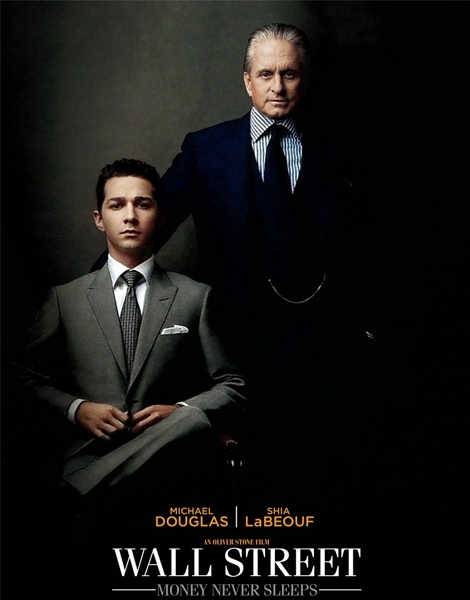
Wall Street: Money Never Sleeps is a 2010 drama starring Michael Douglas and Shia LaBeouf. We are aware this movie has corporate content within the film as they are dressed in suits and  the way the poster is set out it resembles a business or family portrait that could potentially be located in an corporate business office. Michael Douglas (right) is firmly standing over LaBeouf (left), this emphasises the dominance and superiority that Douglas has over the other character. Although the pair appear to be close, his hand is placed behind LaBeouf's back, this signifies that Douglas does not appear to respect him, if he did, his hand would be placed on LaBeouf's shoulder in an endearing fashion. The colours used on the poster are all dark and masculine, this is so that it appeals more to their male audience its typically women are more attracted to brighter, pastel colours. The lighting within the shot could also foreshadow film content; Douglas does not appear to have a bottom half and this could suggest that he possesses secrets and is a withdrawn character within the film as he is not revealing all of himself. The lighting is mainly showing characters facial expressions

Meeting 1 (08/09/2011)

Our first meeting’s agenda was to discuss the ideal genre that we could all work will with and to outline the plot that the film would follow. All team members were present at the meeting; this includes Jordan Kelman, Aisling Byrne, Thomas O’Brien and Bethany Griffin.
The meetings discussion began with what genre we would like our film to follow. After little debate we all agreed that our film would be a romantic comedy. We came to this conclusion as we believed it would be less complicated to create as the majority of rom-coms seem to follow the same structure and have similar plotlines, therefore it would be easier to find inspiration and have a basis structure for our own film.
After deciding on our genre, our attention then turned to the plot summary of the film. Many ideas were brought up regarding the content of the film such as;


            1. A "John Tucker Must Die’ style film- This idea suggested we follow the same storyline as the 2006 movie, but instead having a female lead instead of the stereotypical male.


     2.Following the same storyline as usual romantic comedies where they fall in love in the end, but instead with lesbian/gay lead characters, as its unusual that romantic comedies would use this. However this idea was later dismissed as we decided it would be hard to include usual stereotypes and clichés that rom-coms follow such as men not wanting commitment and women being emotional.


      3.The typical storyline of a man and a woman meeting, their time together, falling out then making up and falling in love at the end of the film. This idea consists of a man and a woman meeting which is followed by 3 dates. After getting drunk, they wake up the next morning to find themselves married. They then set out to get the marriage divorced or annulled as they are not ready for marriage but find themselves falling in love instead. This follows a ‘What happens in Vegas’ style storyline and we believes it will work will as it follows the typical romcom structure and when people watch films of this genre they want it to comply to the genres rules such as happy endings etc and we have chosen to follow idea number 3 because of this.