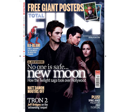
NEW MOON FILM MAGAZINE ANALYSIS
Total Film is a popular film magazine and this issues cover features the cast from the Twilight Saga New Moon. The image used, including the background is lifted straight from the movie poster published by the film and on the cover of Total Film magazine, however the colours have been manipulated slightly. This time, the background is a dark navy colour, this deepens the sense of mystery and darkness that mirrors the content of the film. The masthead of the magazine and the main text that reads 'New Moon' appears to be illuminated, this could be seen as imagery, as if the masthead were the moon as it seems to glow against the background similarly to the film poster where the moon itself is glowing. The main text that advertises New Moon is in the centre and the largest text on the cover, this shows that it relates to the image and is the main focus of the magazine. I think this is a good film cover as it relates largely to the film and gives us a sense of the film content, it includes the main cast members of he feature and follows the structure of a typical magazine.
CHARLIE AND THE CHOCOLATE FACTORY FILM MAGAZINE ANALYSIS

This is another magazine cover from Total Film and features the actor Johnny Depp as his character Willy Wonka in the latest Charlie and The Chocolate Factory Film. He is dressed in full Willy Wonka costume and this shows readers what his character in the film is like appearance-wise, the pose and photo would not have been taken in a shoot set-up by Total Film, but it would have been taken from the films gallery and used for the front cover. It would not be possible for my group to do this (take others images) and we would have to create our own as this would breach copyright laws. The colours used on this front cover are very bright and colourful and this allows the reader to understand the nature of the film; it is a fun and cheerful feature, which is mainly aimed at children. The font is very simple and plainly coloured which suggests that the magazine itself is aiming their prints at male audiences as women are more attracted to brighter colours. Total Film follow the conventions of a regular magazine by including mastheads, side texts and puffs all of these help Total Film appeal to their audiences. Overall i believe this is a good cover for Charlie and The Chocolate Factory as it includes one of the star cast members but apart from the costume Johnny Depp is dressed in, it does not give too much of the films content away.
This is the May 2009 front cover of Empire magazine, which content specializes in films. The particularly film that is starring on the cover is Transformer's 2 where one of its cast members, Megan Fox, poses for Empire magazine. Before reading anything written on the page, it is clear that the magazine cover was intended to appeal to its male audience members as the provocative pose that Megan Fox is in fulfills stereotypes of women being sex symbols. The front cover also shows that the magazine is aimed at males as the colours and font styles used are very masculine. They are mainly blue, deep red, black and grey and the font is pain and not fussy which would appeal to a male audience rather than female. This magazine among with the other two above follows the usual style that a magazine would, its text is around the outside edges of the cover so that the main focus would be on the centre image. Overall, this magazine cover fails to advertise Transformer's 2 well at all, the main image has very little to do with the film itself apart from the fact that she is a cast member and it shows no content or link to the film whatsoever. I would use this research when creating my film magazine poster by ensuring that i link to image to the content of the film i have produced so the audience will have an idea about the nature of my film and what it is about.
TRANSFORMERS 2 FILM MAGAZINE ANALYSIS


No comments:
Post a Comment