NEW MOON FILM POSTER ANALYSIS
New moon is a teenage fantasy/drama and is a book adaptation of the Twilight saga written by Stephanie Meyer. The clouded and obscured mist at the bottom of the poster creates an obscurity about the film, it creates a supernatural feel to the image and exaggerates the theme of the film being mysterious. The trees in the background of the film poster give a sense of darkness and mystery also, the trees lose clarity the further back they get which adds to the unclearness and gives the audience a sense of uncertainty. As the title of the film is 'New Moon' and the moon in the image appears to be very light when placed in the rest of the darkness of the shot, it could indicate that the moon is a focus in the film and holds relevance/importance within the feature. The three characters within the shot (Left to Right, Robert Pattinson, Taylor Lautner and Kristin Stewart) all withhold unhappy and concerned facial expressions with their body facing against or towards each other. Particually with the main charactars, their opposing body languages suggests that they are rival characters within the film. Both male charactars also have clinched fists and this could emphasise the anger and tension that they both share towards each other. The female character is looking directly into the camera, this could show she is the main focus of the film and her hands show she is trying to save or protect the character in the middle of the shot and foreshadows their relationship within the film. The main light within the shot is shown on the facesof the three characters, this could be done to emphasise they are the main focus of the film.
INTOLERABLE CRUELTY FILM POSTER ANALYSIS
Intolerable Cruelty is a romantic comedy starring George Clooney and Catherine Zeta-Jones. The movie poster portrays the genre by using the colour red which has connotations of love and romance. In doing this, the audience are aware of the content of the film and will appeal to their female market which is the usual audience for romantic comedies.
The colours used are bright and bold (Red) which also suggests that it is aimed at women. The font is big and is not considered too plain and simple, it appears to be a ‘romantic’ font this shows the films content and appeals to its female audience. The love heart surrounding the main title text on the movie poster shows it is a film about love, however the thorns could foreshadow film storylines that it could be harsh or dangerous for those involved. The background of the main movie-poster is plain and white, this is used to not distract from the image itself and shows that they are the main focus of the film. Props-wise, the gigantic ring worn on the woman’s left hand is exaggerated and could be a marital symbol and foreshadows the romantic storyline. The clothes that the two leads are wearing also tells us about their characters within the film. The female (Catherine-Zeta Jones) is wearing a tight low-cut red dress which is suggestive and shows the women as a stereo-typical sex symbol. The male (George Clooney) is in a collared button-down blue shirt, which is masculine and explains that his character in the film is a proffesional and strong traditional male. The pose in which the two lead actors are in on the film poster is typical of a romantic comedy poster as explained on popular film magazine, Empire's, online website (http://www.empireonline.com/features/romantic-comedy-movie-poster-cliches). As they are both standing back to back it could suggest that during the film they are on opposing sides of something, indicating they are fighting against each other. They are also not making eye contact or touching each other in an affectionate way (apart from their backs), this could show that there relationship in the film is troubled.

Wall Street: Money Never Sleeps is a 2010 drama starring Michael Douglas and Shia LaBeouf. We are aware this movie has corporate content within the film as they are dressed in suits and the way the poster is set out it resembles a business or family portrait that could potentially be located in an corporate business office. Michael Douglas (right) is firmly standing over LaBeouf (left), this emphasises the dominance and superiority that Douglas has over the other character. Although the pair appear to be close, his hand is placed behind LaBeouf's back, this signifies that Douglas does not appear to respect him, if he did, his hand would be placed on LaBeouf's shoulder in an endearing fashion. The colours used on the poster are all dark and masculine, this is so that it appeals more to their male audience its typically women are more attracted to brighter, pastel colours. The lighting within the shot could also foreshadow film content; Douglas does not appear to have a bottom half and this could suggest that he possesses secrets and is a withdrawn character within the film as he is not revealing all of himself. The lighting is mainly showing characters facial expressions
WALL STREET FILM POSTER ANALYSIS

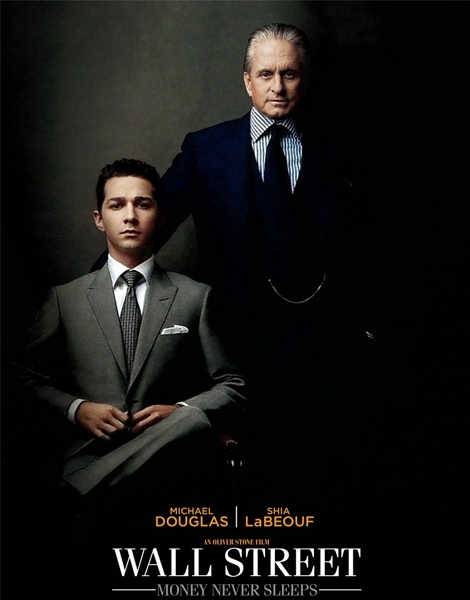
Wall Street: Money Never Sleeps is a 2010 drama starring Michael Douglas and Shia LaBeouf. We are aware this movie has corporate content within the film as they are dressed in suits and the way the poster is set out it resembles a business or family portrait that could potentially be located in an corporate business office. Michael Douglas (right) is firmly standing over LaBeouf (left), this emphasises the dominance and superiority that Douglas has over the other character. Although the pair appear to be close, his hand is placed behind LaBeouf's back, this signifies that Douglas does not appear to respect him, if he did, his hand would be placed on LaBeouf's shoulder in an endearing fashion. The colours used on the poster are all dark and masculine, this is so that it appeals more to their male audience its typically women are more attracted to brighter, pastel colours. The lighting within the shot could also foreshadow film content; Douglas does not appear to have a bottom half and this could suggest that he possesses secrets and is a withdrawn character within the film as he is not revealing all of himself. The lighting is mainly showing characters facial expressions


No comments:
Post a Comment